Table of Contents
One of the annoyances of online newspapers such as the NYT and WaPo is that they recycle content, usually off-the-news-cycle. But this sometimes gets offset by finding something you missed the first time.
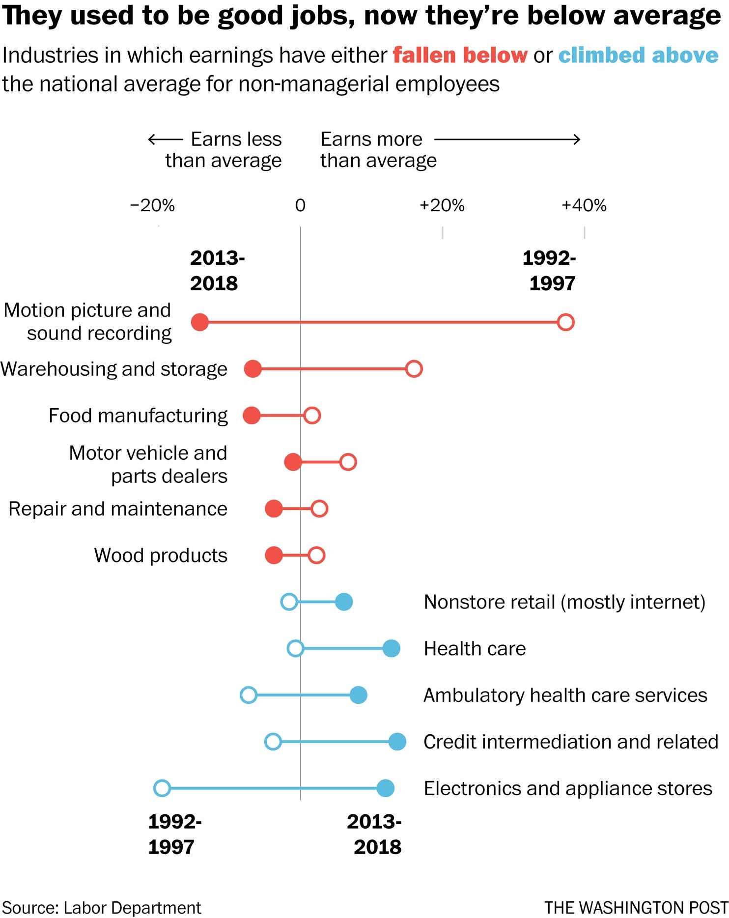
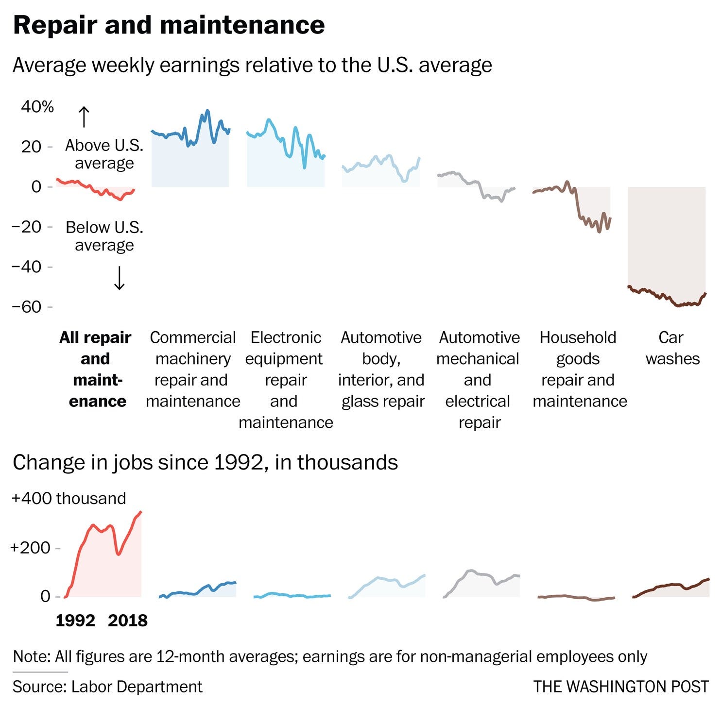
In a recent article on six common occcupations that have changed from above-average to below average pay, the 2018-09-04 article by Andrew Van Dam and Heather Long is illustrated by some effective techniques.
One technique is using the colors in the caption to serve as a legend to color coding in the graphic.

The other is the use of two views of data separated by a caption giving the common variable identifications.

A lot of design thought goes into communicating with economy, and these are two good examples.


